
The project began with a call for help from the intensive care team:
„… I currently work in the neonatal intensive care unit at the Klinikum Links der Weser. Next summer we will move to a new building. The care of premature babies and their parents involves so much more than „just“ intensive care. Unfortunately, we have no lobby whatsoever as far as the color scheme is concerned. White walls, LED spots, … a dreary experience. In terms of equipment, everything will be there, but what makes up our special care is totally lost. Patients and their parents often stay on our ward for months. As nursing staff, our hair stands on end…… This is no way to create an atmosphere of well-being. Can you give us a hand? Can you help us to create a good working atmosphere and enable the fruits to arrive well in this world?…“ (19.11.2020)
Abstract
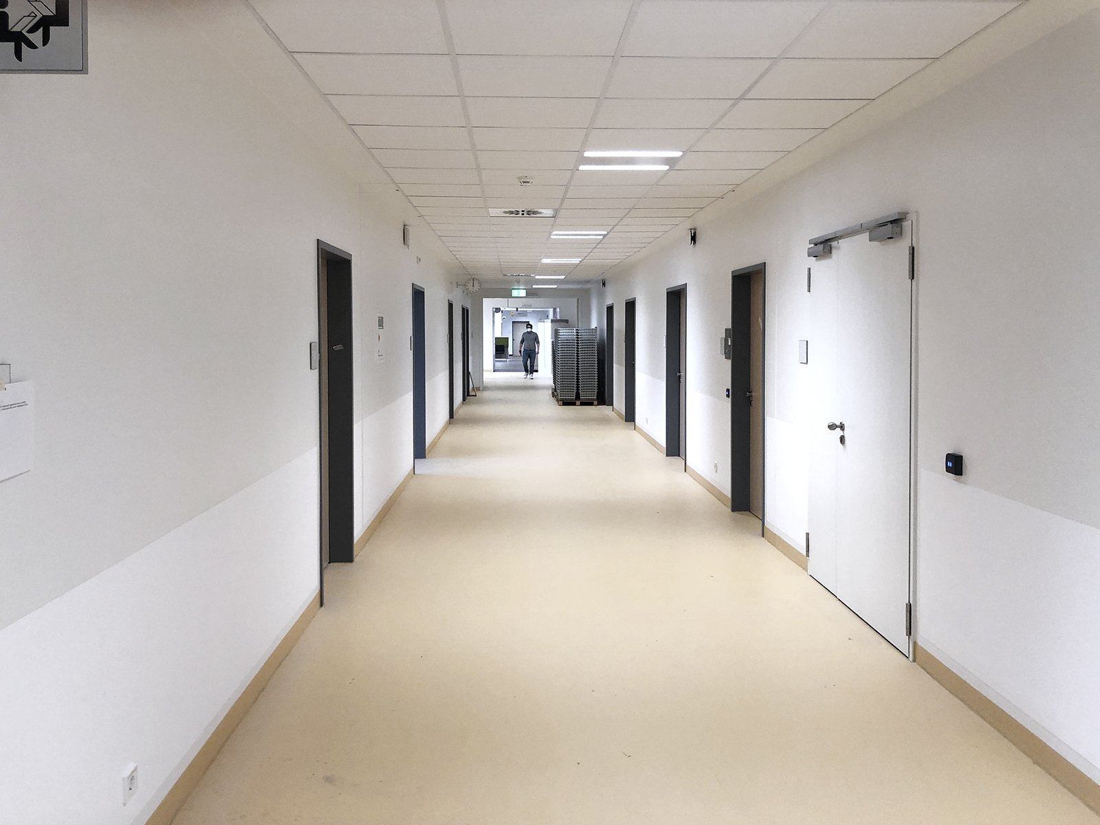
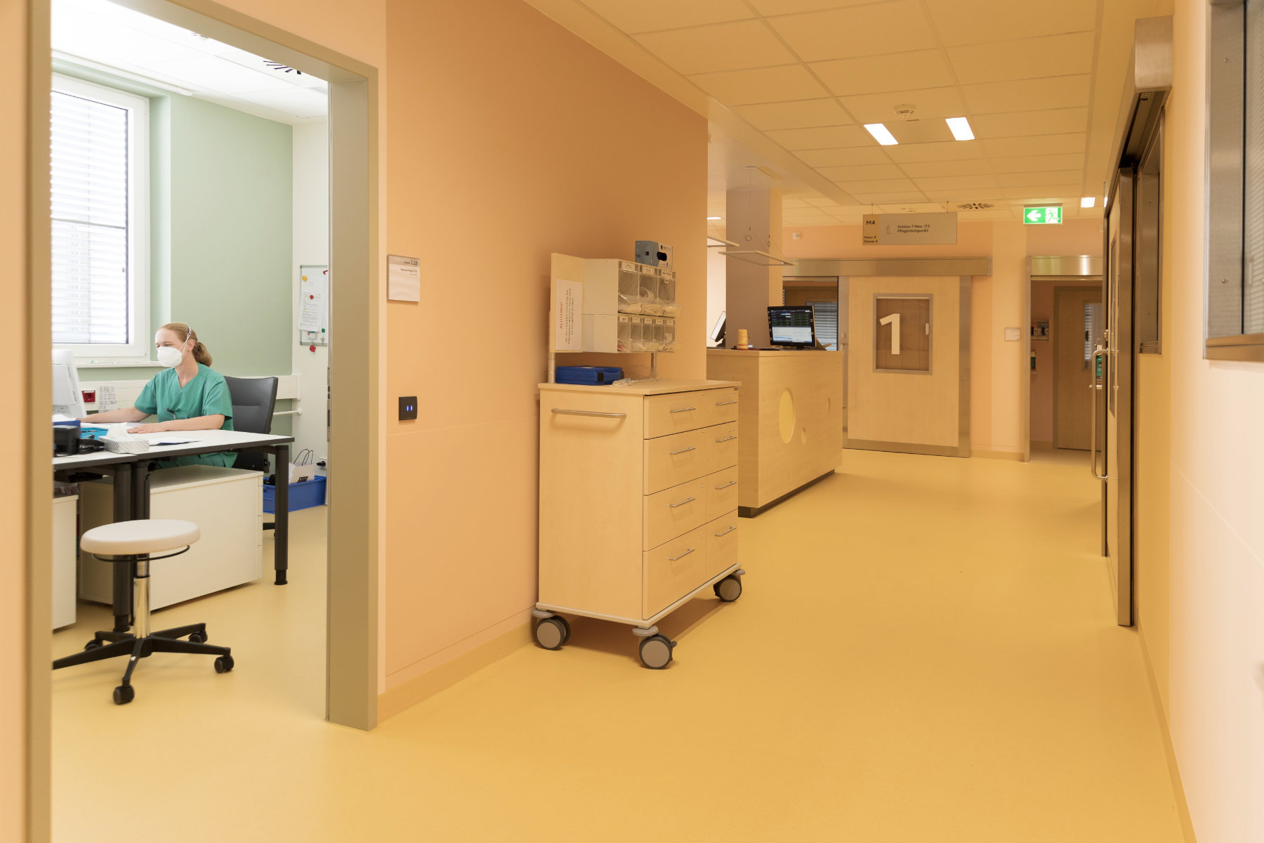
This study examines the influence of color design on the well-being and satisfaction of patients, relatives and staff using the practical example of the department of neonatology in the Clinic for Pediatrics and Adolescent Medicine in Central Hospital Bremen. In continuation of our previous studies, a new building was available for a study here for the first time. The color redesign of the neonatology ward in the new clinic building became necessary because the largely monochrome color design of the ward (white walls and ceilings, yellow floors throughout) met with vehement rejection from the medical, therapeutic and nursing staff, which was expressed both verbally and in writing. The color redesign was carried out in a participatory process according to an evidence-based methodology.
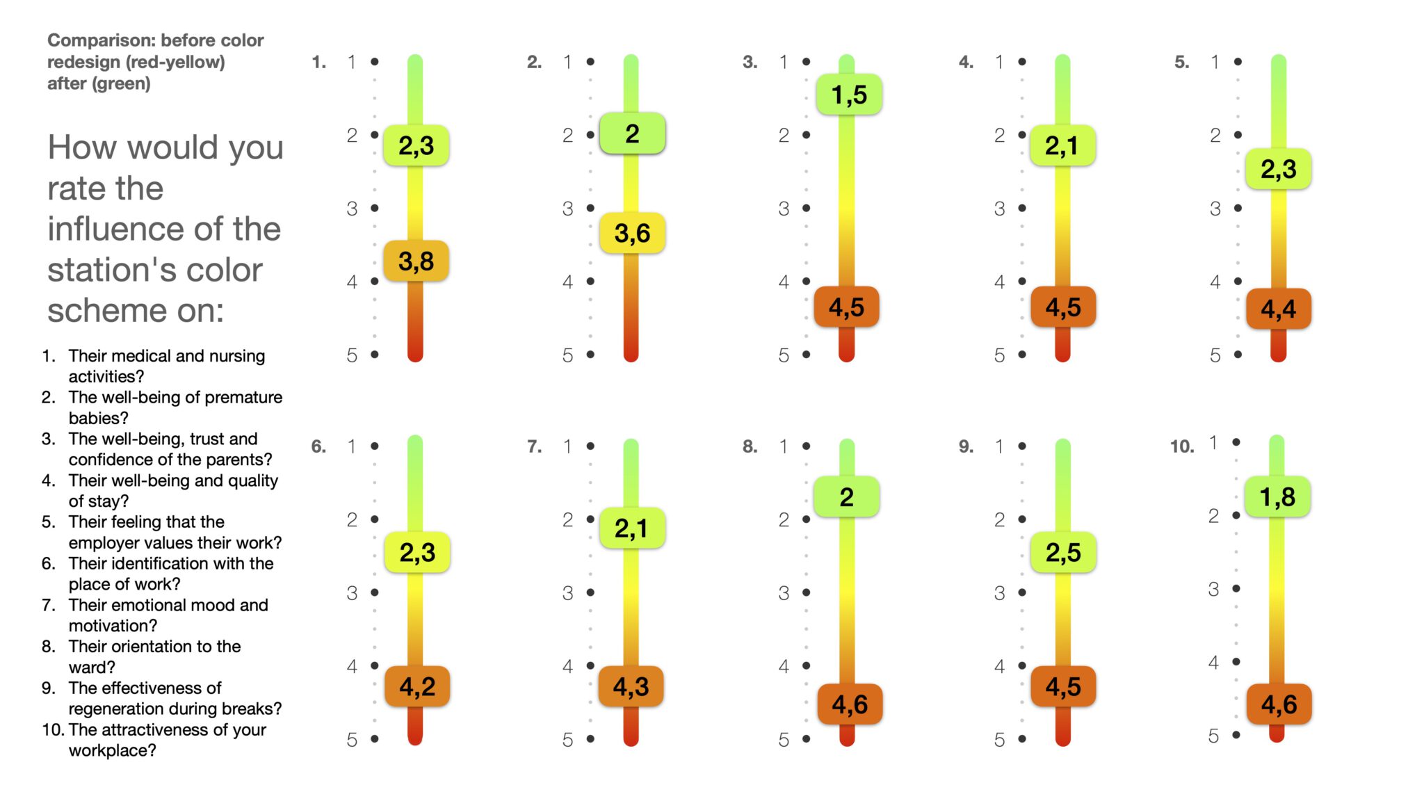
The assessment of well-being, quality of stay, emotional mood, orientation and motivation improved on average by 207% from 4.3 (negative) to 2.1 (positive).
Results of the study:
- the color scheme is a significant factor for the well-being. (Overall result of the survey before the color change from 4.2 rather negative to 2.1 rather positive afterwards).
- white walls do not have a neutral effect, but significantly counteract the well-being of patients, relatives and staff (overall result of the survey before the color change of 4.2 is significantly worse than the neutral result of 3).
- The distribution of the answers proves that the effects of color and space can be objectively assessed, planned and used in the structural context of the utilization situation for the benefit of the user groups concerned. Deviations in the distribution of answers prove that the effects of color in space remain subjective within a range that is tolerable, as it does not significantly affect the success of the design (See chart).
- the color design of the architecture has positive effects on the medical and nursing activities of the staff if it is needs-oriented and evidence-based. (From 3.8 rather negative to 2.3 rather positive)
- the color design of the architecture promotes the well-being of patients if it is needs-oriented and evidence-based (from 3.8 rather negative to 2.3 rather positive)
- architectural color design promotes parent well-being, trust, and confidence when it is needs-based and evidence-based (from 4.4 tending to negative to 1.5 tending to positive)
- architectural color design promotes staff well-being and quality of stay when it is needs-based and evidence-based (from 4.4 tending to negative to 2.1 tending to positive)
- the color design of the architecture promotes the staff’s feeling that the employer values their activity, if it is needs-oriented and evidence-based (from 4.2 rather negative to 2.4 rather positive)
- the color design of the architecture promotes the identification of the staff with the place of work, if it is needs-oriented and evidence-based (from 4.2 rather negative to 2.3 rather positive)
- the color design of the architecture has a positive effect on the emotional mood and motivation of the staff if it is needs-oriented and evidence-based (from 4.2 rather negative to 2.1 rather positive)
- the color design of the architecture has a positive effect on orientation in the ward if it is needs-oriented and evidence-based (from 4.6 negative and 2.0 rather positive)
- the color design of the architecture has a positive effect on the effectiveness of regeneration during breaks, if it is needs-oriented and evidence-based (from 4.6 rather negative to 2.5 rather positive)
- the color design of the architecture has a positive effect on the attractiveness of the workplace for staff if it is needs-oriented and evidence-based (from 4.5 rather negative to 1.8 rather positive)
Cite: Buether, Axel. “Research Paper Color Health Hospital Bremen Neonatology.” Influence of color design on the functionality of new hospital buildings, in particular the well-being of patients, relatives and staff (2022): n. pag. Web. 18.10.2022 DOI: 10.13140/RG.2.2.22488.16645